
A Custom Furniture 3D Interaction Case: Three Decisions That Kept the Project on Track
For furniture brands, the hard part of a 3D interaction showcase is not making a model spin. It is the way door opening, material switching and cabinet combinations stack up, and how fast the workload runs away from the schedule. This piece reviews one project, a 3D showcase for a custom wardrobe and kitchen cabinet range, and focuses on three decisions: the modeling approach, the material strategy and how the interaction list got trimmed. The general format comparison for the industry was covered earlier at four 3D interaction formats for furniture, so this one stays on the ground.
Decision one: model by cabinet unit, not by the whole room
The first request was to put the entire showroom scene into the browser. Full room modeling sounds impressive and fails twice in practice. The polygon count gets hard to compress, loading stretches past ten seconds, and every cabinet change forces a full scene re export, which makes maintenance expensive.
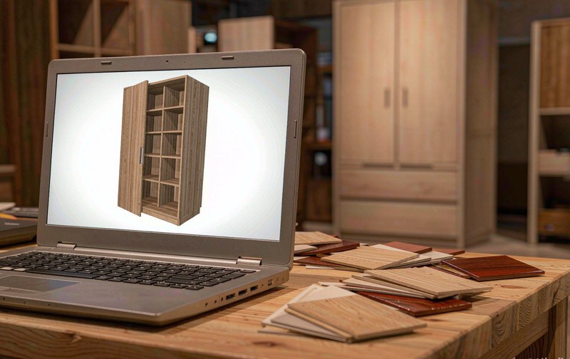
The final approach was modeling by cabinet unit. Each cabinet became an independent group, with doors, drawers and handles as separate parts, and the scene side assembles units by rule. The two and a half tier showroom unit actually shipped as eleven cabinet files plus one assembly rule, so a restyled cabinet means replacing one file. The same approach helped the display layer too, since a visitor can zoom into one corner cabinet and study its interior without loading the whole room.
Decision two: switch materials with scanned textures, not new models
A furniture range easily carries over a hundred finishes, and modeling one variant per finish destroys the budget. The shipped solution kept a single model and handled finishes with scanned textures: each door panel photographed straight on, processed into a seamless texture, paired with roughness and normal maps. Switching a finish swaps the texture set, nothing else.
One warning comes with this route. Texture quality sets the visual ceiling. Wood grain direction on joints and the highlight range on lacquer look obviously wrong when the scan is processed carelessly. When budget is tight, scan the twenty or so best selling finishes first and approximate the long tail procedurally. Full coverage at launch is not a goal worth paying for.
Decision three: trim the interaction list by the sales conversation
The wish list started long: spin, exploded view, dimension labels, share buttons. The filter applied was blunt. If a salesperson uses it during a store conversation, keep it. If it only looks impressive in a demo, cut it. Door opening, drawer pull out, interior layout switching and side by side finish comparison covered most of the actual usage time and all survived. The exploded view and auto tour moved to phase two.
A trimmed list has a side benefit. Training took half a day, because there were only four things to learn. Stacked feature lists usually end up unused, and the same logic appeared in another industry case, the filling machine case where seven interactions were cut, for exactly the same reason.
What to watch after launch
Interaction count is a process metric, not an outcome. Three numbers matter more: how often a session switches finishes, which shows serious comparison; the trigger rate of door opening, which shows interest in the interior; and the share of showcase sessions that turn into an inquiry, which is where the conversion path actually ends. If those three stay flat, the interaction design needs a second look, no matter how good the model looks.
Related Q&A
What does modeling for a furniture 3D showcase usually cost?
Cost scales with cabinet count, interaction items and the finish library. The cabinet unit approach keeps a single cabinet cheap, and the finish library is the real variable: the more scanned textures, the higher the upfront spend. Starting with best selling finishes and expanding later is the usual route.
Is scanning the only way to do material switching?
No. Plain colors and matte surfaces work fine with procedural parameters at low cost. Scanning earns its keep on complex looks such as wood grain and hand painted lacquer, where a careless texture is instantly recognizable as fake.
Should this showcase live on the website or with dealers?
Both, with different weights. The website version must stay light, load fast and complete the inquiry on its own, which maps to the four levels of 3D product interaction. The dealer version can carry heavier features such as cabinet combinations and quote linkage, because the store scene values them more.